5 Intro to Data Visualization with ggplot2
https://learn.datacamp.com/courses/introduction-to-data-visualization-with-ggplot2
5.1 Introduction
Data Viz : i) A core skill in Data Science ii) Intersection betweeen Design and Statistics
To change numeric variables to categorical we use factor() function:
## ── Attaching packages ───────────────────────── tidyverse 1.3.0 ──## ✓ ggplot2 3.3.3 ✓ purrr 0.3.4
## ✓ tibble 3.0.3 ✓ dplyr 1.0.2
## ✓ tidyr 1.1.2 ✓ stringr 1.4.0
## ✓ readr 1.3.1 ✓ forcats 0.5.0## ── Conflicts ──────────────────────────── tidyverse_conflicts() ──
## x dplyr::filter() masks stats::filter()
## x dplyr::lag() masks stats::lag()library(ggplot2)
# Change the command below so that cyl is treated as factor
ggplot(mtcars, aes(factor(cyl), mpg)) +
geom_point()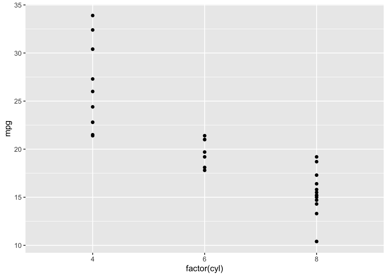
The grammar of graphics :
There are three eswsential grammatical elements:-
- Data (Data set being plotteed)
- Aesthetics (The scales onto which we map our data)
- Geometries (The visual elements used for our data)
Optional LAyers: i) Themes(All non-data ink) ii) Statistics (Representations of our data to aid understanding) iii) Coordinates ( THe space on which data will be plotted) iv) Facets (Plotting small multiples)
## `geom_smooth()` using method = 'gam' and formula 'y ~ s(x, bs = "cs")'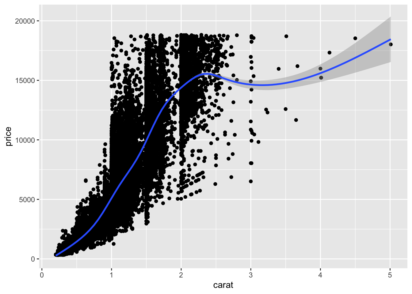 Alpha:
geom_point() has an alpha argument that controls the opacity of the points. A value of 1 (the default) means that the points are totally opaque; a value of 0 means the points are totally transparent (and therefore invisible). Values in between specify transparency.
## `geom_smooth()` using method = 'gam' and formula 'y ~ s(x, bs = "cs")'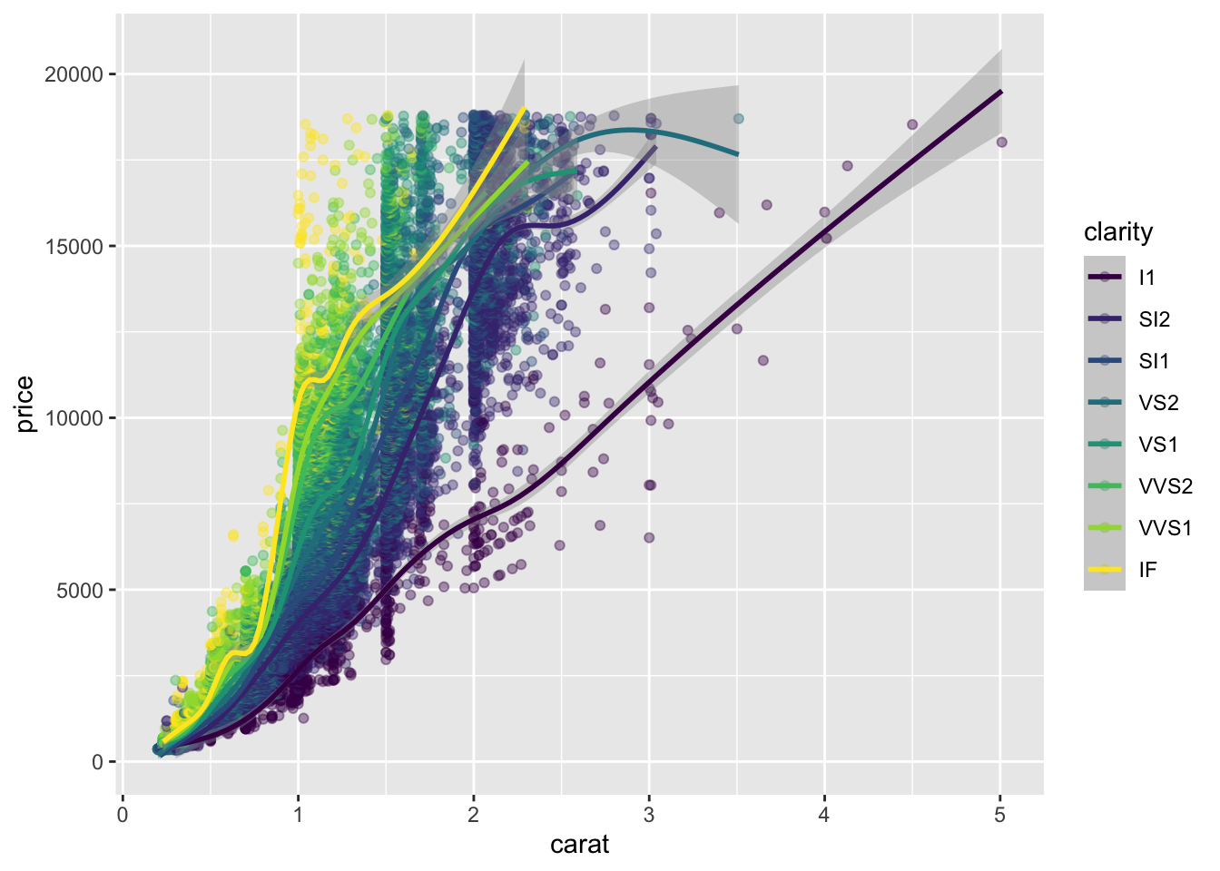
5.2 Aesthetics
Typical visible aesthetics:
- x = X axis position
- y = Y axis position
- fill = Fill color
- size = Are or radius of points, thickness of lines
- alpha = Transparency
- linetype = line dash pattern
- labels = Text on a plot or axes
- shape = Shape
Aesthetic vs attributes:
# A hexadecimal color
my_blue <- "#4ABEFF"
# Change the color mapping to a fill mapping (AESTHETICS)
ggplot(mtcars, aes(wt, mpg, fill = hp)) +
# Set point size and shape (ATTRIBUTES)
geom_point(color = my_blue, size = 10, shape = 1)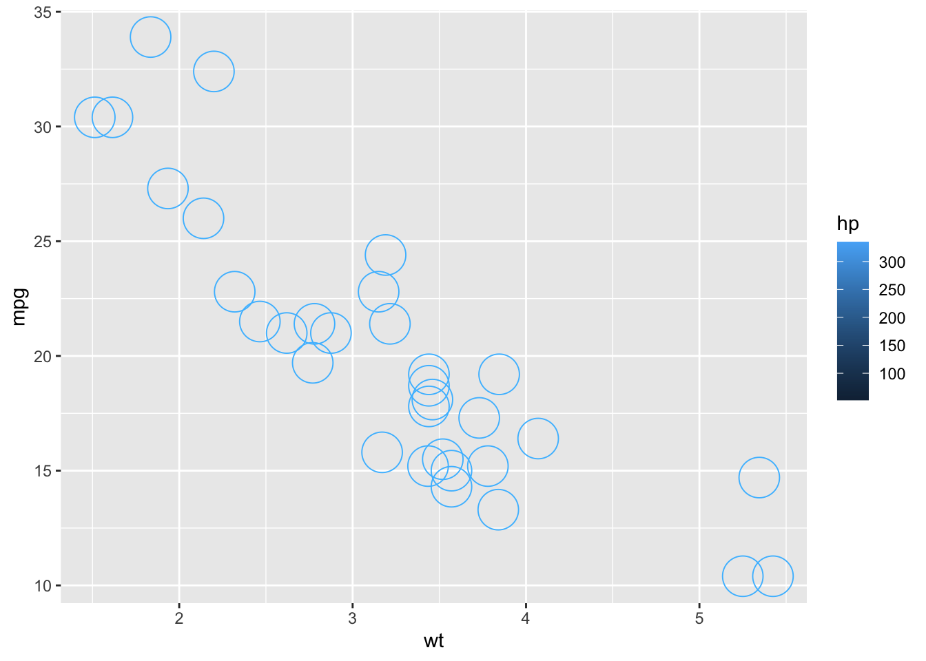
In order to add text, we use the geom_text() function and to use row names of a data set, we set the label of the attribute - label as rownames(name of data set).
ggplot(mtcars, aes(wt, mpg, color = fcyl)) +
# Add text layer with label rownames(mtcars) and color red
geom_text(label = rownames(mtcars), color = 'red')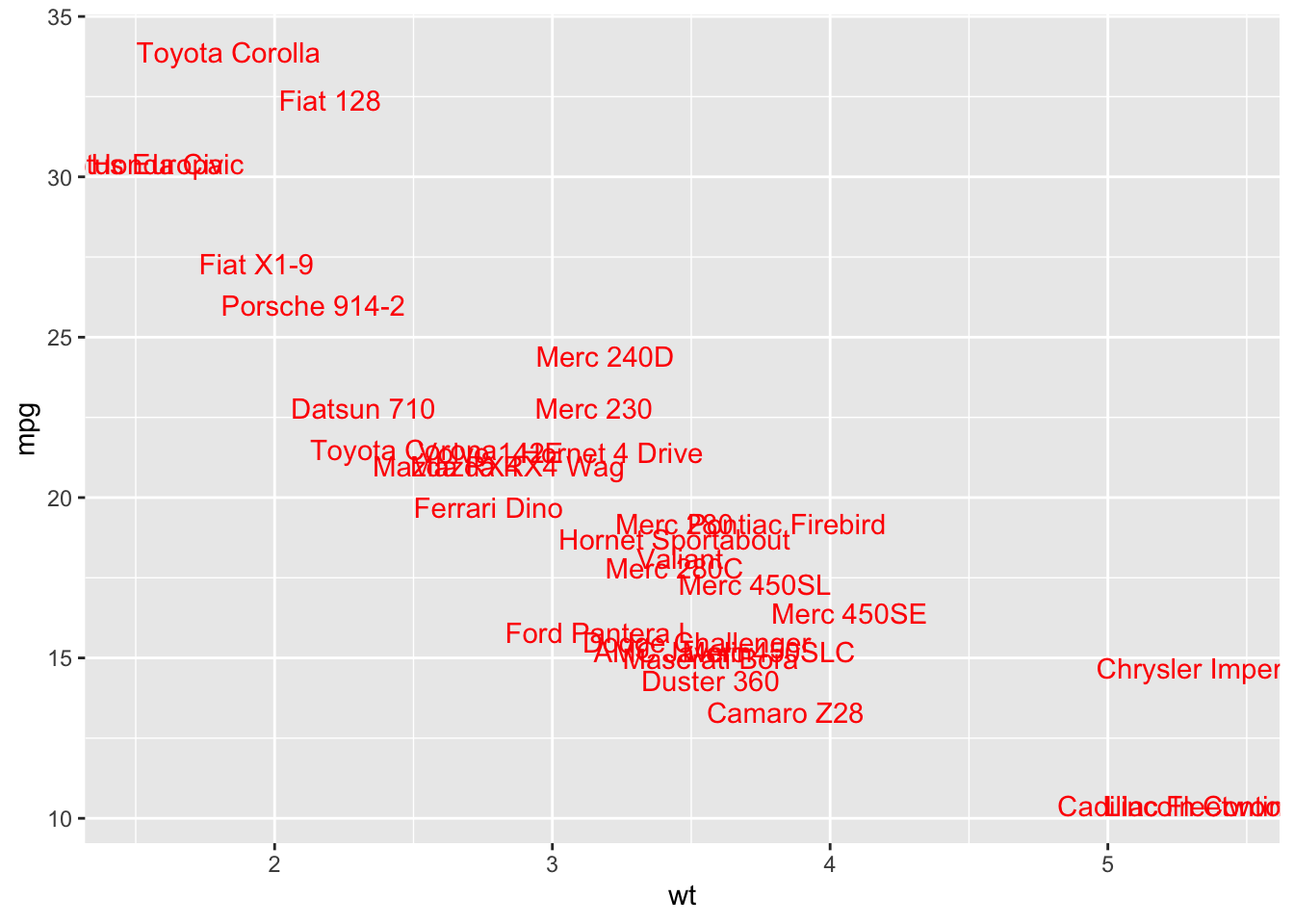
Modifying aesthetics:
Identity = identity basically means dont do anything with the data.
jitter = set arguements for the position and maintain consistency across plots and layers
We labs() to set the x- and y-axis labels. It takes strings for each argument.
Scale_color_manual() defines properties of the color scale (i.e. axis). The first argument sets the legend title. values is a named vector of colors to use.
To Implement a custom fill color scale we use scale_fill_manual()
palette <- c(automatic = "#377EB8", manual = "#E41A1C")
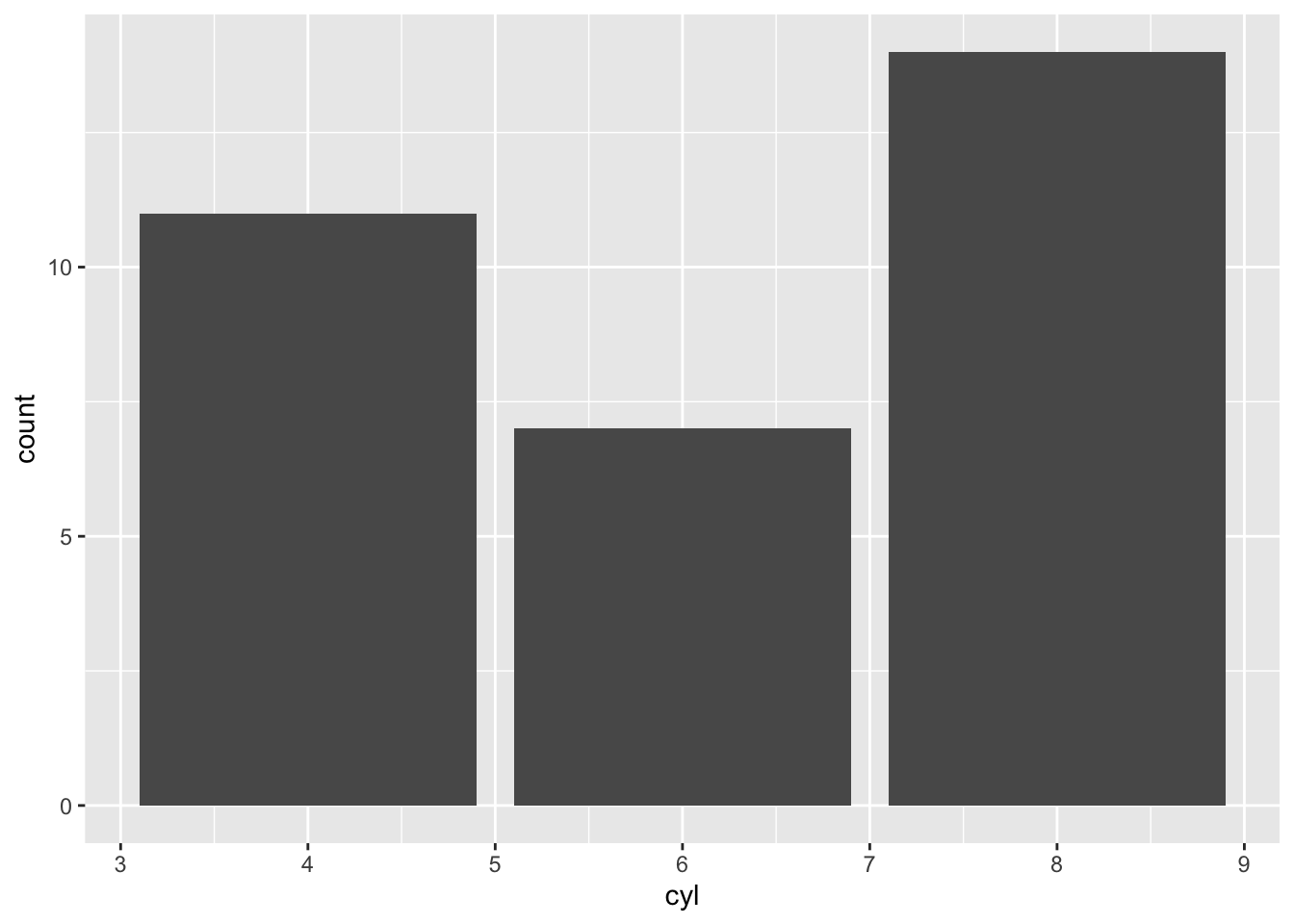
ggplot(mtcars, aes(cyl, fill = am)) +
geom_bar(position = 'dodge') +
labs(x = "Number of Cylinders", y = "Count")
## <ggproto object: Class ScaleDiscrete, Scale, gg>
## aesthetics: fill
## axis_order: function
## break_info: function
## break_positions: function
## breaks: waiver
## call: call
## clone: function
## dimension: function
## drop: TRUE
## expand: waiver
## get_breaks: function
## get_breaks_minor: function
## get_labels: function
## get_limits: function
## guide: legend
## is_discrete: function
## is_empty: function
## labels: waiver
## limits: NULL
## make_sec_title: function
## make_title: function
## map: function
## map_df: function
## n.breaks.cache: NULL
## na.translate: TRUE
## na.value: NA
## name: Transmission
## palette: function
## palette.cache: NULL
## position: left
## range: <ggproto object: Class RangeDiscrete, Range, gg>
## range: NULL
## reset: function
## train: function
## super: <ggproto object: Class RangeDiscrete, Range, gg>
## rescale: function
## reset: function
## scale_name: manual
## train: function
## train_df: function
## transform: function
## transform_df: function
## super: <ggproto object: Class ScaleDiscrete, Scale, gg>You can make univariate plots in ggplot2, but you will need to add a fake y axis by mapping y to zero.
When using setting y-axis limits, you can specify the limits as separate arguments, or as a single numeric vector. That is, ylim(lo, hi) or ylim(c(lo, hi))
Typically, the dependent variable is mapped onto the the y-axis and the independent variable is mapped onto the x-axis.
5.3 Geometries
We should be aware of overplotting: Aligning values on a single axis.
Overplotting 2: Aligned values
This occurs when one axis is continuous and the other is categorical, which can be overcome with some form of jittering.
plt_mpg_vs_cyl_by_am <- ggplot(mtcars, aes(cyl, mpg, color = am))
# Default points are shown for comparison
plt_mpg_vs_cyl_by_am + geom_point()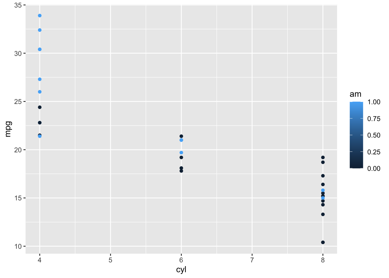
# Now jitter and dodge the point positions
plt_mpg_vs_cyl_by_am + geom_point(position = position_jitterdodge(jitter.width = 0.3, dodge.width = 0.3))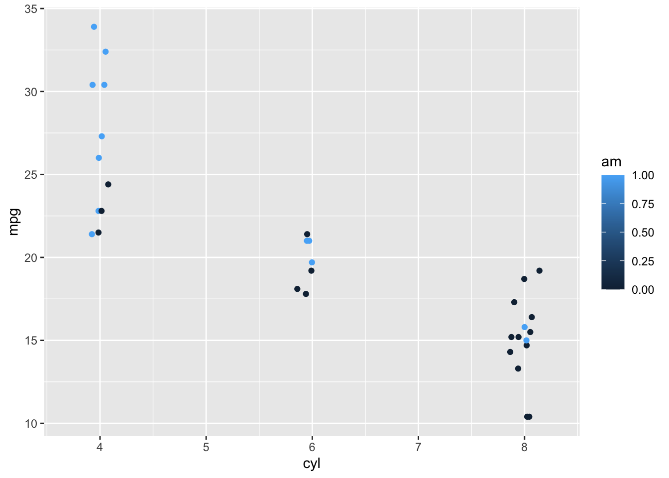
Overplotting 3: Low-precision data
Overplotting 4: Integer data
Positions in histograms:
stack (the default): Bars for different groups are stacked on top of each other. dodge: Bars for different groups are placed side by side. fill: Bars for different groups are shown as proportions. identity: Plot the values as they appear in the dataset.
ggplot(mtcars, aes(mpg, fill = am)) +
geom_histogram(binwidth = 1, position = "identity", alpha = 0.4)
Bar Plots:
geom_bar() [stat = “count”] : counts the number of cases at each X position geom_col() [stat = “identity”] : plots actual values


We can customize bar plots further by adjusting the dodging so that your bars partially overlap each other. Instead of using position = “dodge”, we’re going to use position_dodge()
The reason we want to use position_dodge() (and position_jitter()) is to specify how much dodging (or jittering) we want.
5.4 Themes
Themes are all non-data ink visual elements which are not part of the data. THere are three types of themes -
- Text : element_text()
- Line : element_line()
- Rectangle : element_rect()
Moving the legend: Legend is defined as an area of the graph plot describing each of the parts of the plot.
To change stylistic elements of a plot, call theme() and set plot properties to a new value. For example, the following changes the legend position.
[p + theme(legend.position = new_value)]
Here, the new value can be
- “top”, “bottom”, “left”, or “right’”: place it at that side of the plot.
- “none”: don’t draw it.
- c(x, y): c(0, 0) means the bottom-left and c(1, 1) means the top-right.
ggplot(mtcars, aes(mpg, fill = am)) +
geom_histogram(binwidth = 1, position = "identity", alpha = 0.4)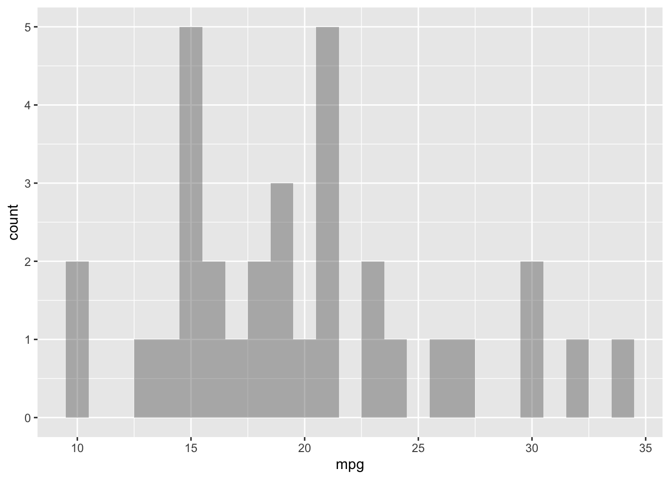
Bar Plots:
geom_bar() [stat = “count”] : counts the number of cases at each X position geom_col() [stat = “identity”] : plots actual values
ggplot(mtcars, aes(cyl, fill = am)) +
# Set the position to "fill"
geom_bar(position = 'fill') +
theme(legend.position = c(0.6,0.1))
ggplot(diamonds, aes(carat, price, color = clarity)) +
  geom_point(alpha = 0.4) +
geom_smooth() +
theme(
# For all rectangles, set the fill color to grey92
rect = element_rect(fill = "grey92"),
# For the legend key, turn off the outline
legend.key = element_rect(color = NA)
)## `geom_smooth()` using method = 'gam' and formula 'y ~ s(x, bs = "cs")'
ggplot(diamonds, aes(carat, price, color = clarity)) +
  geom_point(alpha = 0.4) +
  geom_smooth() +
  theme(
    rect = element_rect(fill = "grey92"),
    legend.key = element_rect(color = NA),
    axis.ticks = element_blank(),
    panel.grid = element_blank(),
    # Add major y-axis panel grid lines back
    panel.grid.major.y = element_line(
      # Set the color to white
      color = "white",
      # Set the size to 0.5
      size = 0.5,
      # Set the line type to dotted
      linetype = "dotted"
    )
  )
## `geom_smooth()` using method = 'gam' and formula 'y ~ s(x, bs = "cs")'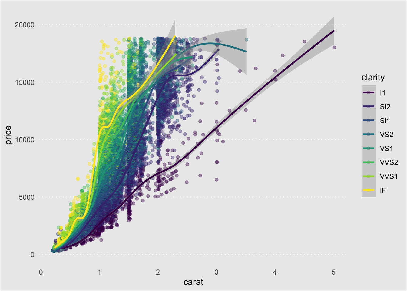
Whitespace means all the non-visible margins and spacing in the plot.
To set a single whitespace value, use unit(x, unit), where x is the amount and unit is the unit of measure.
Borders require you to set 4 positions, so use margin(top, right, bottom, left, unit). To remember the margin order, think TRouBLe.
ggplot(diamonds, aes(carat, price, color = clarity)) +
  geom_point(alpha = 0.4) +
  geom_smooth() +
  theme(
    # Set the plot margin to (10, 30, 50, 70) millimeters
    plot.margin = margin(10, 30, 50, 70, "pt")
  )
## `geom_smooth()` using method = 'gam' and formula 'y ~ s(x, bs = "cs")'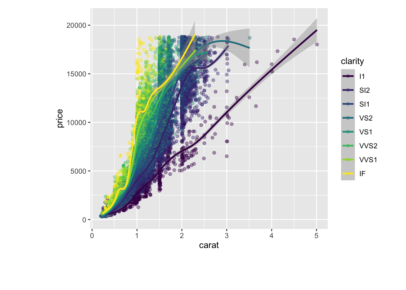
In addition to making your own themes, there are several out-of-the-box solutions that may save you lots of time.
theme_gray() is the default. theme_bw() is useful when you use transparency. theme_classic() is more traditional. theme_void() removes everything but the data
ggplot(diamonds, aes(carat, price, color = clarity)) +
  geom_point(alpha = 0.4) +
  geom_smooth() +
  theme_classic()
## `geom_smooth()` using method = 'gam' and formula 'y ~ s(x, bs = "cs")'
ggplot(diamonds, aes(carat, price, color = clarity)) +
  geom_point(alpha = 0.4) +
  geom_smooth() +
  theme_void()
## `geom_smooth()` using method = 'gam' and formula 'y ~ s(x, bs = "cs")'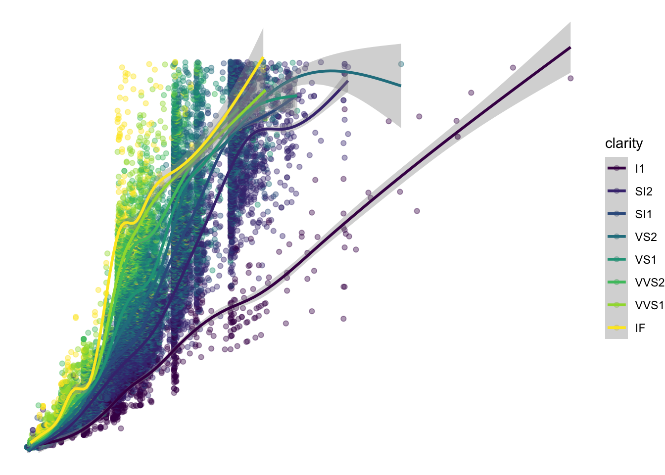
ggplot(diamonds, aes(carat, price, color = clarity)) +
  geom_point(alpha = 0.4) +
  geom_smooth() +
  theme_bw()
## `geom_smooth()` using method = 'gam' and formula 'y ~ s(x, bs = "cs")'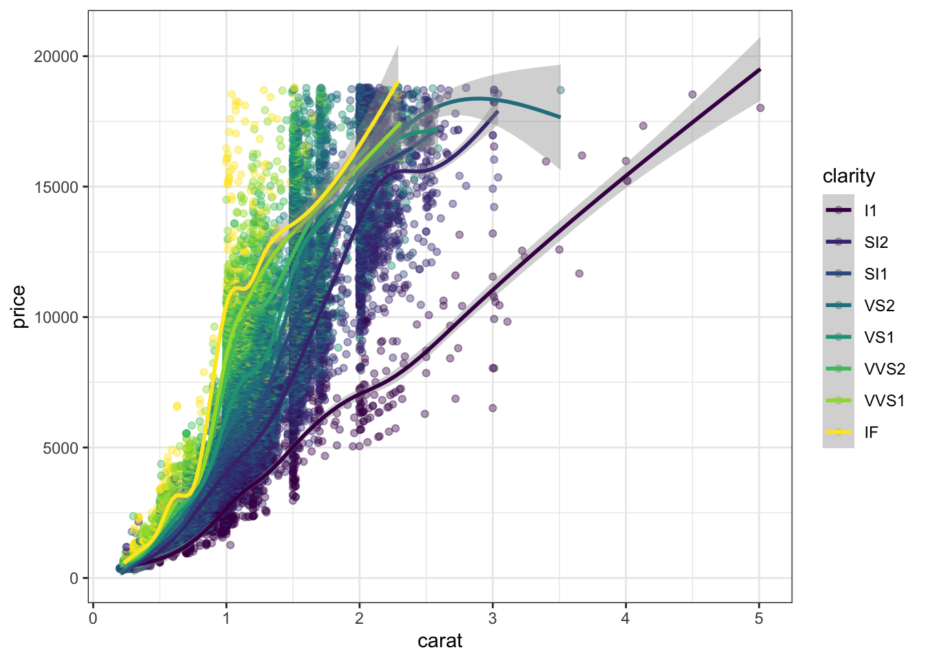
Exploring ggthemes:
Outside of ggplot2, another source of built-in themes is the ggthemes package.
library(ggthemes)

ggplot(diamonds, aes(carat, price, color = clarity)) +
  geom_point(alpha = 0.4) +
  geom_smooth() +
  theme_fivethirtyeight()
## `geom_smooth()` using method = 'gam' and formula 'y ~ s(x, bs = "cs")'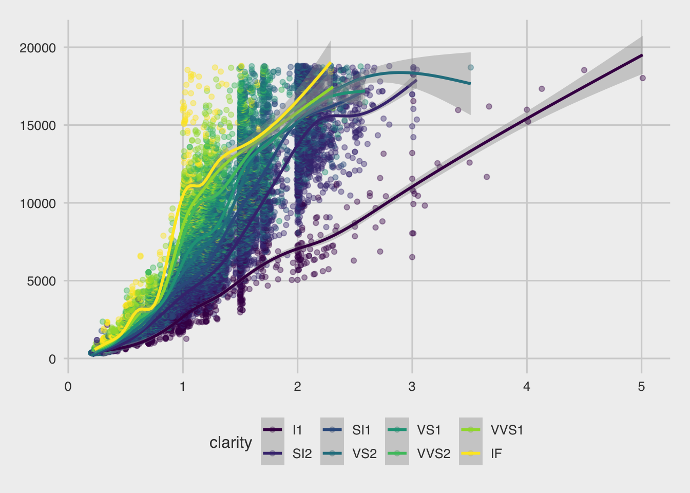
ggplot(diamonds, aes(carat, price, color = clarity)) +
  geom_point(alpha = 0.4) +
  geom_smooth() +
  theme_tufte()
## `geom_smooth()` using method = 'gam' and formula 'y ~ s(x, bs = "cs")'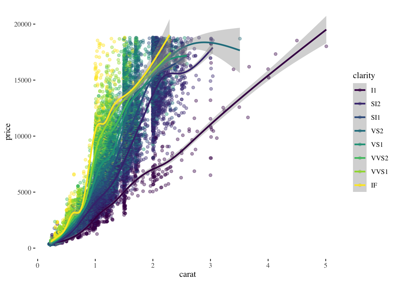
ggplot(diamonds, aes(carat, price, color = clarity)) +
  geom_point(alpha = 0.4) +
  geom_smooth() +
  theme_wsj()
## `geom_smooth()` using method = 'gam' and formula 'y ~ s(x, bs = "cs")'
Setting themes:
Reusing a theme across many plots helps to provide a consistent style. You have several options for this.
theme_custom <- theme(
  rect = element_rect(fill = "grey92"),
  legend.key = element_rect(color = NA),
  axis.ticks = element_blank(),
  panel.grid = element_blank(),
  panel.grid.major.y = element_line(color = "white", size = 0.5, linetype = "dotted"),
  axis.text = element_text(color = "grey25"),
  plot.title = element_text(face = "italic", size = 16),
  legend.position = c(0.6, 0.1)
)

#We can combine two themes.

theme_combine <- theme_custom + theme_wsj()

ggplot(diamonds, aes(carat, price, color = clarity)) +
  geom_point(alpha = 0.4) +
  geom_smooth() +
  theme_combine
## `geom_smooth()` using method = 'gam' and formula 'y ~ s(x, bs = "cs")'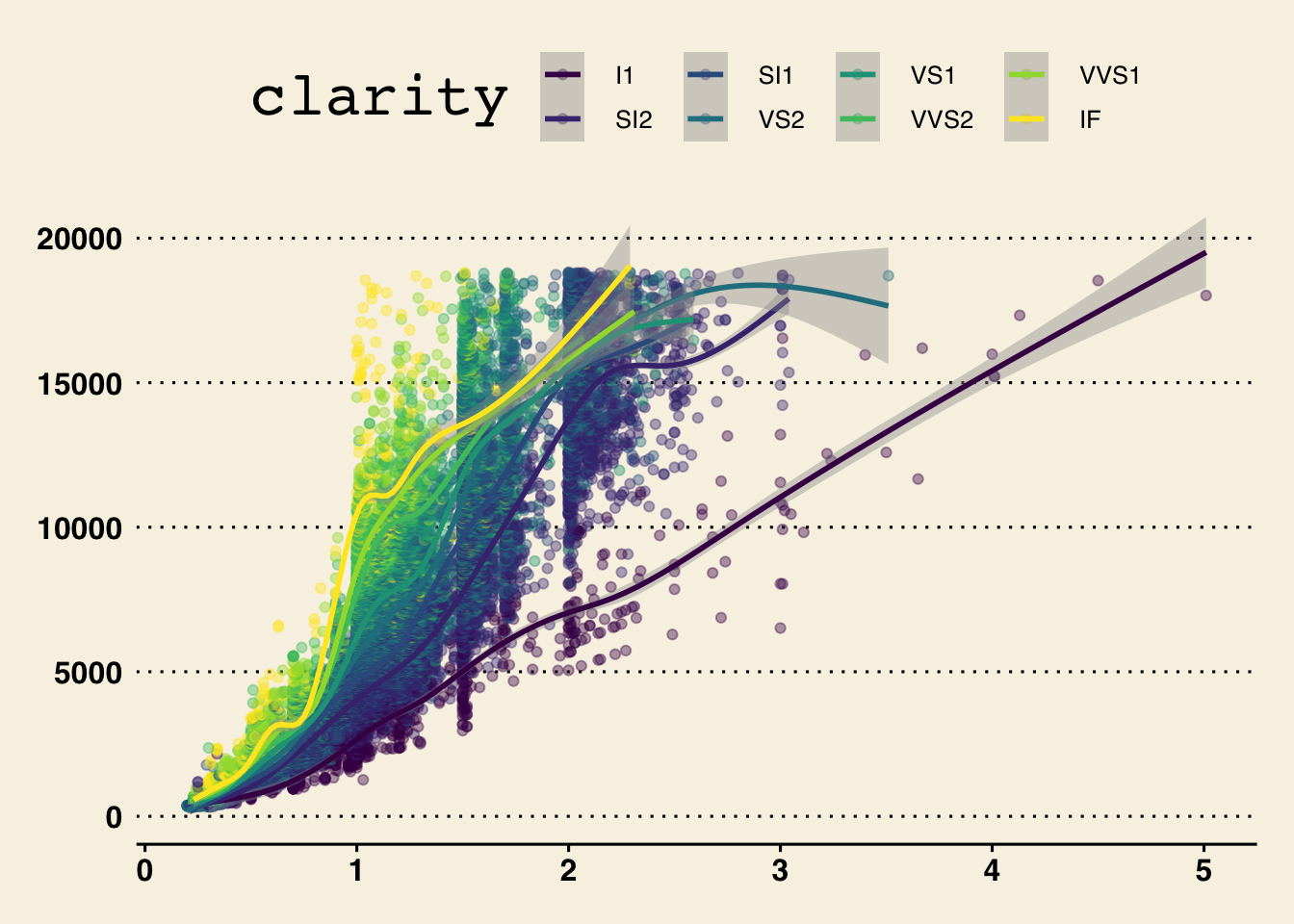
To set theme_custom as a default theme, we use :
Example:
ggplot(diamonds, aes(carat, price, color = clarity)) +
  geom_point(alpha = 0.4) +
  geom_smooth() +
  theme_tufte() +
  # Add individual theme elements
  theme(
    # Turn off the legend
    legend.position = "none",
    # Turn off the axis ticks
    axis.ticks = element_blank(),
     # Set the axis title's text color to grey60
    axis.title = element_text(color = "grey60"),
    # Set the axis text's text color to grey60
    axis.text = element_text(color = "grey60"),
    # Set the panel gridlines major y values
    panel.grid.major.y = element_line(
      # Set the color to grey60
      color = "grey60",
      # Set the size to 0.25
      size = 0.25,
      # Set the linetype to dotted
      linetype = "dotted"
    )
  )
## `geom_smooth()` using method = 'gam' and formula 'y ~ s(x, bs = "cs")'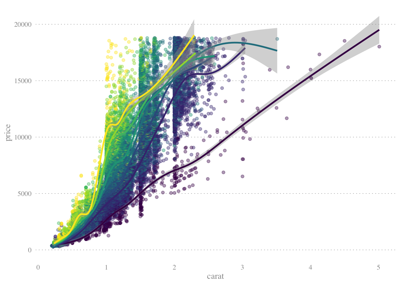
Example : GAPMNIDER DATASET (Scratch Work)
Set the color scale: palette <- brewer.pal(5, “RdYlBu”)[-(2:4)]
ggplot(gm2007, aes(x = lifeExp, y = country, color = lifeExp)) + geom_point(size = 4) + geom_segment(aes(xend = 30, yend = country), size = 2) + geom_text(aes(label = round(lifeExp,1)), color = “white”, size = 1.5) + scale_x_continuous("“, expand = c(0,0), limits = c(30,90), position =”top“) + scale_color_gradientn(colors = palette) + labs(title =”Highest and lowest life expectancies, 2007“, caption =”Source: gapminder")
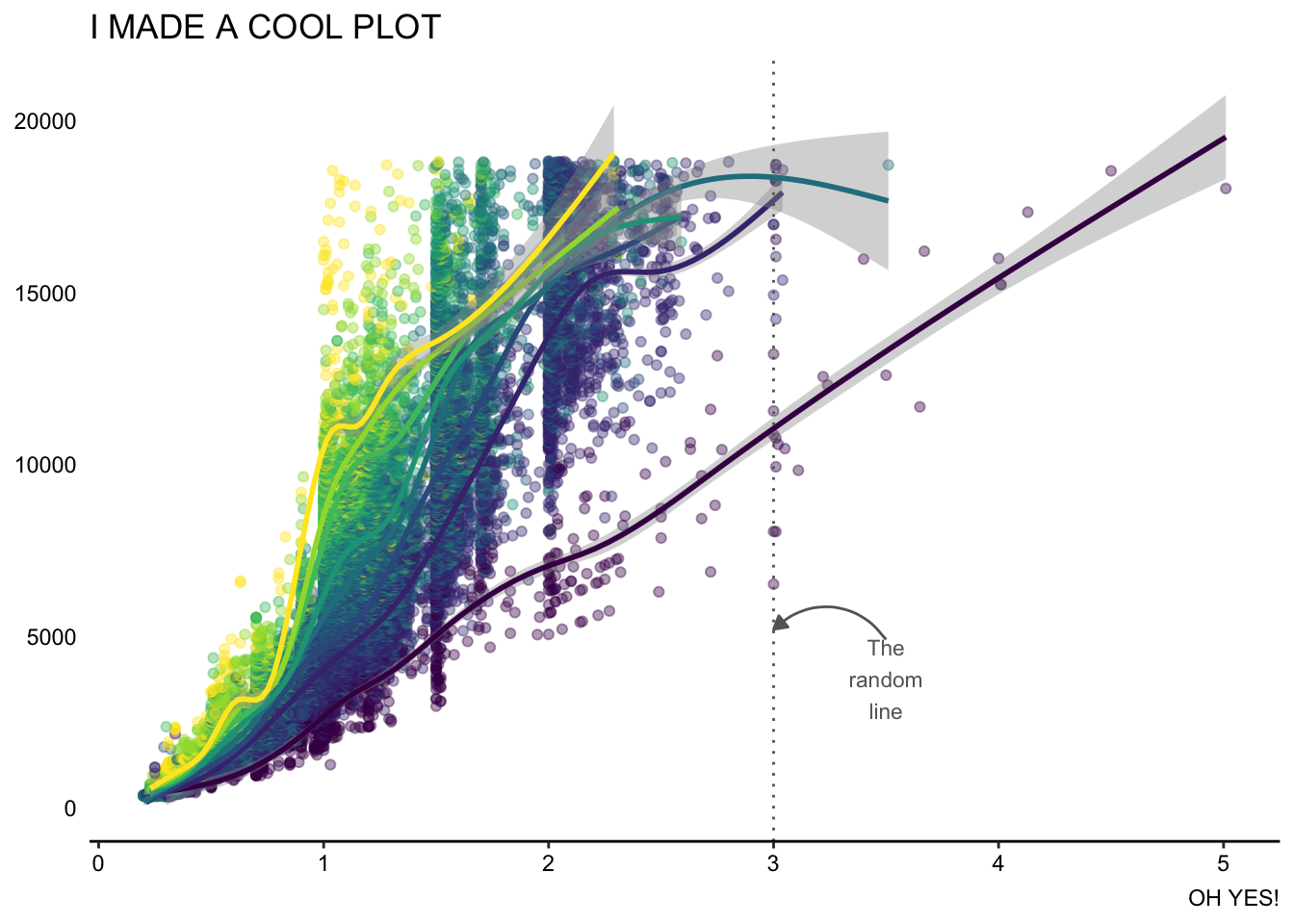
How to define a theme:
ggplot(diamonds, aes(carat, price, color = clarity)) +
  geom_point(alpha = 0.4) +
  geom_smooth() +
  theme_tufte()  +
  theme_classic() +
  theme(axis.line.y = element_blank(),
        axis.ticks.y = element_blank(),
        axis.text = element_text(color = "black"),
        axis.title = element_blank(),
        legend.position = "none") +
        geom_vline(xintercept = 3, color = "grey40", linetype = 3) +
  annotate(
    "text",
    x = 3.5, y = 4900,
    label = "The\nrandom\nline",
    vjust = 1, size = 3, color = "grey40"
  ) +
  annotate(
    "curve",
    x = 3.5, y = 4900,
    xend = 3, yend = 5200,
    arrow = arrow(length = unit(0.2, "cm"), type = "closed"),
    color = "grey40"
  ) +
  labs(title = "I MADE A COOL PLOT", caption = "OH YES!")
## `geom_smooth()` using method = 'gam' and formula 'y ~ s(x, bs = "cs")'